


How to evaluate leading indicators
So, what are predictive factors, anyway?

I started this Substack, as I found close to zero investment research material that I’d consider rigorous-enough “predictive analytics” — also the reason why I co-founded Unravel.
What I rather see a lot is: the price of the asset, and another metric plotted on the same chart, with someone proclaiming that “This has been a leading indicator — watch what will happen now!”.
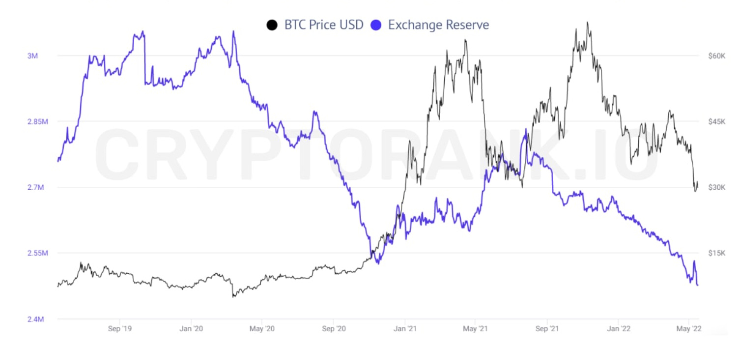
This can be very misleading: you can’t tell if a leading indicator actually was effective by eyeballing charts like this — even if you spent days trying to compare every little movement — you need a different lens.
You need charts that show what happened when your metric was in a certain range or printed a specific value. For example:
What happened in the next 30 days to Bitcoin (on average) when there were lots of funds moving to crypto exchanges?
That’s what you want to judge your favorite metric by, if you want to be objective.
For this to be done reliably, you need to normalize the time series first: you can’t simply use the dollar amount of crypto exchange outflows - as the market has grown 10x over the last 5 years, $100 million means much less now than back then.
Rather, you want to use a transformation that compares the current value to the value last year (much like year-over-year growth). See how the “rolling percentile” translates an erratic series into a more regular one, that ranges between 0-1:


Now that we have a time series where highs and lows are comparable across different years, we can look at what happens when Exchange Outflows were low (orange) or high (blue):

The goal is to find factors where there’s a substantial difference between what happens at the extremes (lows vs highs).
This one is a relatively good example: it’s you could see that holding Bitcoin when there were large outflows from exchanges resulted in considerably higher next month returns, and there were barely any change in price when outflows were low.
There are also other methods to visualize predictive power:


People use "correlation” as a measure of how assets move together — but you could also use it to understand how effective a leading indicator is, by measuring the correlation coefficient between a factor and Bitcoin’s next 30 day returns.
Here, you’ll want to see a clear relationship, either upward or downward sloping, before you start relying on a metric.
The market is not at all constant
Predictive strength changes over time — the same way the market evolves. There’s no single metric that’d explain more than a small amount of future fluctuations, or even if it does, it will not last long (and definitely not forever).
And there’s an underlying reason for that: as the macro regime changes, the factors influencing an asset’s returns are also changing. Bitcoin as a geeky side-project will have different factors moving it than at the height of the memecoin-era.
You can monitor changes in predictive power as well, by looking at the rolling correlation coefficient — how that number changed over time:

Our goal is to make these reports available to anyone who wants to peek behind the curtain, and look at what factors are driving the markets: it has been an endlessly fascinating and useful endeavor for us, and it’s hard to imagine not having access to it now.
See some of the reports below:


