The usual things people first look at when designing new trading systems is trend following / mean reversion — while in practice there are a wide range of other: liquidity, macroeconomic & sentiment factors that also heavily influence an asset’s returns (sometimes even cross-asset lead-lag relationships!).
You may hear sometimes talking heads on CNBC reciting their favorite macro metric and their interpretation, and it's easy to dismiss them when your aim is to make data driven decisions - but their rationale may not be entirely worthless.
Let's dive in whether we can turn the on-chain analysts favorite metric, exchange outflows into a profitable, systematic strategy. You can also try it yourself, as the code/data required to reproduce it is here!
The Rationale - Why Exchange Outflows could be predictive?
Blockchain can be a lot of things for a lot of different people — what’s certain is that they’re a bit less opaque than traditional markets, because of the existence of the public ledger.
We can take advantage of the fact that the biggest crypto exchanges disclose their wallet addresses for transparency reasons - it means that part of the money flow can be tracked, way before the orders hit the market. Although spot volume is only 10-25% of the overall crypto volume - lots of leverage going on in the futures - but the effect is still significant.
When investors / traders move crypto assets to exchanges, that’s a potential sell order, waiting to happen. If people were sitting on large amount of stablecoins, that could be a potential buy order - but that’s a topic of a different day.
Moving crypto assets off exchanges (to cold wallets), on the other hand, indicates some level of confidence - at least the immediate intention is probably not to sell it.
The (Predictive) Stats
First, let’s check if the statistics also look right - we can’t really use the raw time series, as the market capitalization of cryptocurrencies changed substantially over the last couple of years, so $20m daily outflows in 2020 is not the same as $20m in 2025. After normalization, we get this:

Judging whether this is a useful leading indicator from this is pretty much impossible, but plotting the average 30 day BTC returns when Exchange Outflows were around 1 (very high) or 0 (very low) could reveal the pattern we’re looking for:
This looks okay! The higher the outflows, the higher the next 30 day average returns - that’s what we should be looking for when evaluating leading indicators.
Ideally, when Exchange Outflows are really low BTC would have negative 30 day returns, but that may be too much to ask for with an asset that had a 500% increase in value over the last 5 years (shifting all of these bins into positive territory).
The Validation (Backtesting)
To see if this could have been turned into a systematic trading strategy means we’d need to come up with some rules how to trade it:
The safest way would be to scale the normalized (0-1) values to a -1 to 1 range (100% allocation to short or long), adjusting the position daily. This way we avoid any kind of over-fitting - although it may result in an under-optimized strategy, it’s worth taking a look at its performance.

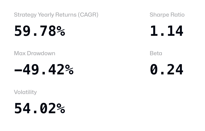
The strategy’s statistics look like this (after fixed 0.5% transaction costs are deducted in each direction it trades, which includes fees, bid-ask spread & slippage):
Check out the code here!
It definitely hasn’t performed as well in returns as Bitcoin itself, but it does it with little beta (co-movement with Bitcoin), which means it has potential:
Mix it in as an uncorrelated strategy to any portfolio (next to a set of systematic strategies).
Optimize it based on arbitrary thresholds to long/short BTC or not to hold any position.
Look at how Exchange Outflows could influence less mature crypto assets’ returns: BTC has the most eyeballs, which usually means least amount of alpha.
Apply basic risk management on top of the strategy.
Look at the cross-sectional returns of Exchange Outflows for assets where it’s available.
All of the research here can be reproduced with code in this repo. The interactive version of the report is here - where you can also get the data.
There’s so much more that could be done that we will explore in later articles, so subscribe for more content!


